by admin | Jul 12, 2018
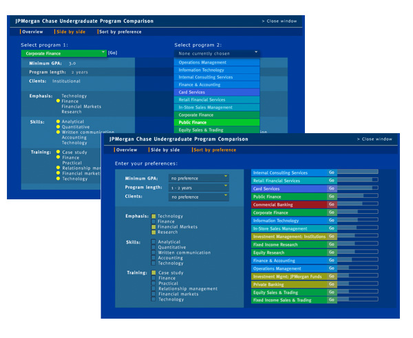
Many firms offer charts that describe programs or business units. This tool allows students to enter their own preferences for sorting, taking comparison to a higher level. Client: JPMorgan Chase
by admin | Jul 11, 2018
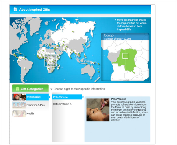
Potential UNICEF donors can drag a graphic magnifier across a world map and get information about countries that have received UNICEF Inspired Gifts. Client: UNICEF
by admin | Jul 10, 2018
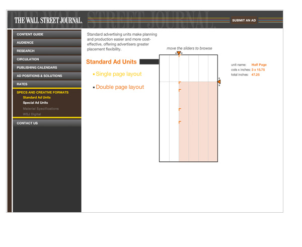
Standard and Special ad units are described interactively on the Wall Street Journal website for advertising sales. Client: Wall Street Journal
by admin | Jul 8, 2018
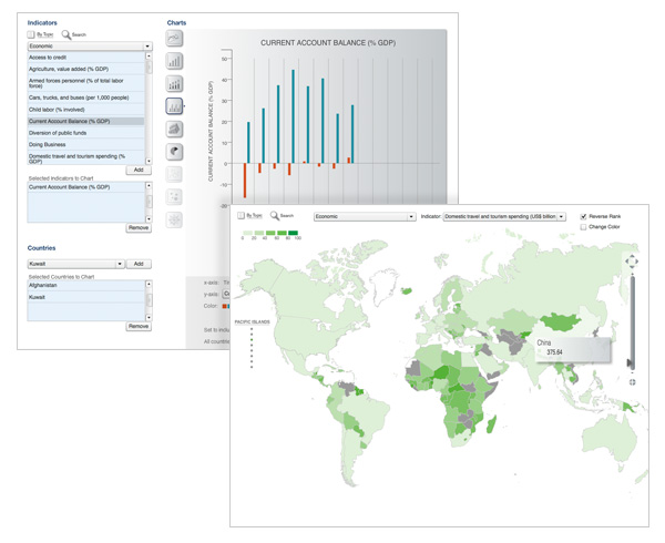
A web-based tool lets data analysts compare any countries across hundreds of measurable indicators, generate an appropriate chart-based visualization and export both data and graphics from the analysis. Client: U.S. Government
by admin | Jul 6, 2018
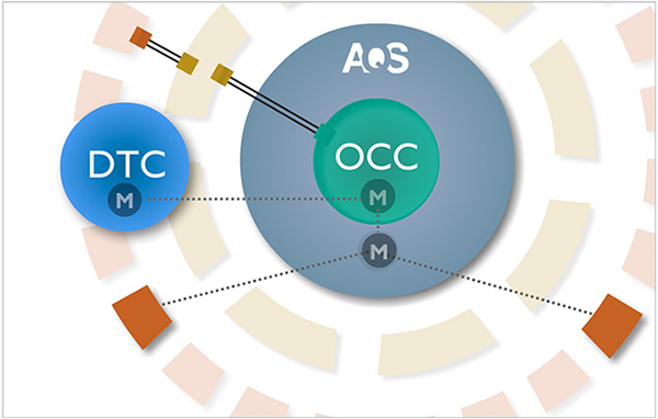
A Flash tool helps AQS visualize the structure of their market and demonstrate the various relationships among members. Client: AQS





Recent Comments